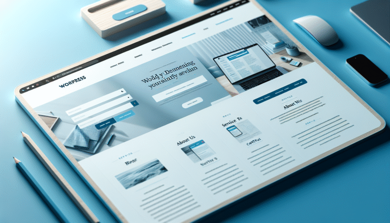
Let’s discuss something crucial yet often overlooked: your portfolio. That carefully assembled showcase of your finest work, which you’ve likely spent countless late nights perfecting. Here’s the harsh truth—most viewers will spend less than 30 seconds deciding if you’re worth their time. Painful, right?
You’ve dedicated weeks, perhaps months, to crafting your portfolio. You’ve agonized over the design, layout, and images and refined your copy meticulously.
But in reality, your masterpiece might only receive a fleeting glance before it’s dismissed faster than you can say “responsive design.”
Why does your portfolio get such brief attention from potential clients, recruiters, or employers? How can you ensure those 30 seconds work in your favor?
Let’s break it down, with minimal design jargon. (You’re welcome.)
1. First Impressions Matter…A Lot
Imagine you’re a hiring manager or a potential client. You open a portfolio and within three seconds, you’re forming an opinion. It’s human nature.
We judge based on appearance, layout, and overall vibe. You’ve done it when glancing at a restaurant menu and deciding against it because the design didn’t appeal. We all do it.
The same applies to your portfolio. In that brief window, you must make it clear that you’re the one they’ve been waiting for. That means presenting something visually striking and relevant.
Your first image or project should make an impact. This is your “wow” moment, showing you’re not just good—you’re amazing.
That piece should reflect your style, skills, and unique design approach. Think of it as a first impression at a party: It’s the “Hi, I’m fun and also really good at making people laugh” vibe you want to convey.
2. The 3-Second Rule (But Actually 30 Seconds)
Now, let’s address the 30-second rule. It’s almost like a bad Tinder date where your portfolio is your profile picture, and the recruiter is the potential match. If your portfolio doesn’t impress in the first few seconds, they’ll move on.
Why? Because people are busy. We’re inundated with information—emails, Slack messages, TikTok videos, and existential crises. No one has time to read about your journey or elaborate design process.
You must quickly capture attention, clearly showing what you do, how you do it, and why you’re the best.
Recruiters, hiring managers, and potential clients are busy. Like, too busy to waste time on portfolios that don’t get to the point.
They have resumes to skim, interviews to schedule, and emails to sort. If your portfolio doesn’t grab attention instantly, they’ll close the tab faster than you can hit “Ctrl+Z” on a design mistake. And after reviewing 50+ portfolios, their attention span is about that of a goldfish.
3. Be Concise, But Don’t Be Boring
When it comes to your portfolio, brevity is key. Don’t overwhelm with lengthy essays about each project. Instead, keep descriptions concise, clear, and compelling.
Remember the elevator pitch? Your portfolio needs one, too, visible within seconds. Answer the big questions immediately: What do you do? How do you do it? Why should I care?
Here’s a poor elevator pitch: “I’m a designer who creates artful, meaningful, and transformative experiences.”
And a better one: “I design sleek, user-friendly websites that drive conversions for e-commerce businesses.”
See the difference? The second one clearly states what you do and your strengths without fluff.
4. Don’t Overload on Fancy Features (And Other Potential Disasters)
We get it. You know HTML, CSS, JavaScript, and a bit of React. You’ve attended web design conferences and experimented with all the bells and whistles. But remember: less is more.
If your homepage is cluttered with sliding carousels, hover effects, and animations, it’s like an explosion in a tech store. Nobody wants that.
Your portfolio needs to load fast (really fast), be easy to navigate, and offer a smooth user experience. Some fancy animations are fine, but don’t let them overshadow the content.
Fun fact: 40% of people abandon a website if it takes more than 3 seconds to load. Unless your design is the digital equivalent of a Beyoncé concert, it won’t get a pass for slow performance.
5. Your Portfolio is a Showcase, Not a Novel
A common mistake designers make is getting too caught up in the backstory. You spent weeks perfecting your work and want to share your creative process, inspirations, and user research. But your portfolio isn’t a TED Talk. It’s a showcase of your best work.
Include some process insights, but don’t let them dominate. Employers and clients don’t need every detail unless it’s essential.
Show the outcome, and let your designs speak for themselves.